In last month's "It's in the Guidelines," Tiffany explained how to access our many resources on the Thesis Office website. Knowing where to look up formatting help will save you a lot of time. Now, I want to add to her post in order to stress the importance of actually using these guidelines. That is, the guidelines not just there for you to look at them if you feel like it. They're there because you NEED to look at them. In the words of one of our Thesis Office mottos, "If you don't use the guidelines, you'll do it wrong."
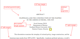
For instance, you'll start off on the wrong foot from the get-go if you don't look at the abstract and title page templates. How in the world would you figure these things out by guessing? You wouldn't!
All successfully defended and submitted theses go through a revision process with this office. Why? To fix the formatting...which is explained in the guidelines. (I apologize if this is giving you flashback to "IT'S IN THE SYLLABUS"). Many students are surprised by how much more work they need to do. When they think they are completely done because they had a great dissertation defense, and then find out they have to make scores of corrections, it's kind of a buzzkill. If you've submitted your defended document on time, you will still graduate! But, the better that document looks at the time of submission, the more headache you'll save yourself. You should be planning a graduation party or looking for a job, not tweaking margins and re-labeling tables and setting fire to your laptop.
For another example, see the figure below. Figures and tables are labeled differently. Figures have the number and title below, while tables have them above. There are also different conventions for naming each, and their placement within the document. Did you think about that before? Some published students already know about such conventions, but many others do not.
There is a reason that some journals look great and consistent from cover to cover. An editor followed exacting guidelines to get it that way. The Thesis Office has exacting guidelines so that NIU sends documents out into the world that represent the high quality of the graduate scholarship done here. We want you to look great, because you are great!
 |
| more guidelines... |
Finally, the most common problem students come to visit us about is their page numbers. Unless you have published a book, you probably haven't had to wrangle page numbers a lot. We have a very informative video on how to do it, and the simple logic of it can save you hours. Check it out!
After seeing students' worst problems over the years, we know what needs to be clarified. Use the list of guidelines and the red-marked templates on our site, and you won't need to see so much red ink on your own document. Thanks for reading -- now go read the guidelines!
Templates and Examples: https://www.niu.edu/grad/thesis/templates-examples.shtml
Video Tutorials: https://www.niu.edu/grad/thesis/video-tutorials.shtml


No comments:
Post a Comment